by admin | Jun 1, 2014 | |
London's A-Z Key places turned into witty cards A series of 8 square cards designed for Art Meets Matter Ltd – product design and gift company. Card titles were based on ‘found’ sections of the A-Z of London: Noel, Sugar Sugar, NeatHouse, Friend, Great, Wow, Valentine, Love. Each place retouched and enhanced from scanned print sections of London’s A-Z. Sold in Blackwells and design-lead retailers. All3D VisualsAppBookBrandingCatalogueCorporate IdentityDigital RetouchingFabricFurnitureIllustrationLightingLogotypePackagingPlayPrintProductStationeryTypefaceTypographyWeb/Online Swallows and Amazons Digital Retouching, Illustration, Print, Product, Stationery Appleby: Notebooks Book, Illustration, Print, Product, Stationery TimeOut – iPhone 3D Visuals, Print, Product, Typography Ordnance Survey – iPhone 3D Visuals, Packaging, Product, Typography Designs Brochure Catalogue, Print, Stationery, Typography Shake your ‘Bot 3D Visuals, App, Illustration, Play, Product, Web/Online Faber Poetry Playing Cards Packaging, Print, Product, Typography Jane Green – The Beach Fabric, Furniture, Product Harrogate Crime Festival Fabric, Furniture, Product Thesaurus Book, Print, Typeface, Typography A-Z Cards Digital Retouching, Product, Stationery, Typography Softbacks™ Furniture, Logotype, Typography Transport for London Branding, Logotype, Typography Treasure Island Book, Digital Retouching, Print, Typography U-Bend Lighting, Logotype, Product, Typography Milli Lighting, Logotype, Product, Typography Open Secret Branding, Logotype, Typography Stone Paper Knife Ltd Branding, Catalogue, Corporate Identity, Logotype, Print,...
by admin | Jun 1, 2014 | |
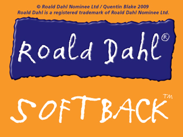
Softbacks™ Branding and Logotype Trademark creation (Softback) and branding design for a new range of beanbag seats. Designed around the theme of books each Softback had a fabric tag which imitated the classic bookmark. This particular design was used to prototype beanbags based on Roald Dahl’s children’s books. It incorporates a unique typeface based on Quentin Blake’s handwriting. All3D VisualsAppBookBrandingCatalogueCorporate IdentityDigital RetouchingFabricFurnitureIllustrationLightingLogotypePackagingPlayPrintProductStationeryTypefaceTypographyWeb/Online Swallows and Amazons Digital Retouching, Illustration, Print, Product, Stationery Appleby: Notebooks Book, Illustration, Print, Product, Stationery TimeOut – iPhone 3D Visuals, Print, Product, Typography Ordnance Survey – iPhone 3D Visuals, Packaging, Product, Typography Designs Brochure Catalogue, Print, Stationery, Typography Shake your ‘Bot 3D Visuals, App, Illustration, Play, Product, Web/Online Faber Poetry Playing Cards Packaging, Print, Product, Typography Jane Green – The Beach Fabric, Furniture, Product Harrogate Crime Festival Fabric, Furniture, Product Thesaurus Book, Print, Typeface, Typography A-Z Cards Digital Retouching, Product, Stationery, Typography Softbacks™ Furniture, Logotype, Typography Transport for London Branding, Logotype, Typography Treasure Island Book, Digital Retouching, Print, Typography U-Bend Lighting, Logotype, Product, Typography Milli Lighting, Logotype, Product, Typography Open Secret Branding, Logotype, Typography Stone Paper Knife Ltd Branding, Catalogue, Corporate Identity, Logotype, Print,...

by admin | Jun 1, 2014 | |
Interchange Logotype Logotype development for a range of Tfl products Interchange is a trademarked brand-name co-development by Tony Davis and David Ellis (Transport for London – Tfl). Tony Davis created the logotype and styling options. It was developed to label and describe a range of design-lead objects and materials exploiting aspects of Tfl IP and particularly the London Tube Map (Diagram). It was based on Tfl’s Johnston typeface and the interchange symbol used for lines changes on London’s Tube. The designs were labelled and exhibited by a number of licensees at 100% Design London, 100% Design Rotterdam, Ambiente, Spring Fair and other events in the UK and Europe. A London Routemaster bus was also equipped with the designs and driven to the Milan Fair to illustrate the range. All3D VisualsAppBookBrandingCatalogueCorporate IdentityDigital RetouchingFabricFurnitureIllustrationLightingLogotypePackagingPlayPrintProductStationeryTypefaceTypographyWeb/Online Swallows and Amazons Digital Retouching, Illustration, Print, Product, Stationery Appleby: Notebooks Book, Illustration, Print, Product, Stationery TimeOut – iPhone 3D Visuals, Print, Product, Typography Ordnance Survey – iPhone 3D Visuals, Packaging, Product, Typography Designs Brochure Catalogue, Print, Stationery, Typography Shake your ‘Bot 3D Visuals, App, Illustration, Play, Product, Web/Online Faber Poetry Playing Cards Packaging, Print, Product, Typography Jane Green – The Beach Fabric, Furniture, Product Harrogate Crime Festival Fabric, Furniture, Product Thesaurus Book, Print, Typeface, Typography A-Z Cards Digital Retouching, Product, Stationery, Typography Softbacks™ Furniture, Logotype, Typography Transport for London Branding, Logotype, Typography Treasure Island Book, Digital Retouching, Print, Typography U-Bend Lighting, Logotype, Product, Typography Milli Lighting, Logotype, Product, Typography Open Secret Branding, Logotype, Typography Stone Paper Knife Ltd Branding, Catalogue, Corporate Identity, Logotype, Print,...

by admin | Jun 1, 2014 | |
Treasure Island Transforming the Island of Unst into Treasure Island The Unstlanders of the Sheltands island of Unst have always claimed that their island inspired R. L. Stevenson when he drew his own map for Treasure Island. Visiting his father, who was building Muckle Flugga lighthouse, the shape of the island and its bleakness sowed seeds of a treasure map. This work was intensive Photoshop pixel editing and retouching. The island needed to be assembled from more than one OS Landranger grid unit. All the roads, buildings and other modern evidence of civilisation had to removed from the flat file composite of the Ordnance Survey map of Unst. New icons were created. Whole areas covered with trees. Areas of sea had new grid lines and numbering created. Contours were re-drawn (2 pixel size) and placenames added in sympathetic typography to seamlessly suggest that the OS team of mappers had been there and seen it all. Part of a series of ‘modern’ maps of imagined places for a book to be published in 2015 including: Pemberley, Manderley, Northanger Abbey, Wuthering Heights and other places of ‘fiction’. Or are they…? Before digital retouching After digital retouching All3D VisualsAppBookBrandingCatalogueCorporate IdentityDigital RetouchingFabricFurnitureIllustrationLightingLogotypePackagingPlayPrintProductStationeryTypefaceTypographyWeb/Online Swallows and Amazons Digital Retouching, Illustration, Print, Product, Stationery Appleby: Notebooks Book, Illustration, Print, Product, Stationery TimeOut – iPhone 3D Visuals, Print, Product, Typography Ordnance Survey – iPhone 3D Visuals, Packaging, Product, Typography Designs Brochure Catalogue, Print, Stationery, Typography Shake your ‘Bot 3D Visuals, App, Illustration, Play, Product, Web/Online Faber Poetry Playing Cards Packaging, Print, Product, Typography Jane Green – The Beach Fabric, Furniture, Product Harrogate Crime Festival Fabric, Furniture, Product...

by admin | Jun 1, 2014 | |
u-Bend™ Product logotype Logotype created for POS and display materials at 100% Design 2008. u-Bend was a playful new lighting concept based on PVC plumbing sections. This was a sister product for the Milli™ logotype. All3D VisualsAppBookBrandingCatalogueCorporate IdentityDigital RetouchingFabricFurnitureIllustrationLightingLogotypePackagingPlayPrintProductStationeryTypefaceTypographyWeb/Online Swallows and Amazons Digital Retouching, Illustration, Print, Product, Stationery Appleby: Notebooks Book, Illustration, Print, Product, Stationery TimeOut – iPhone 3D Visuals, Print, Product, Typography Ordnance Survey – iPhone 3D Visuals, Packaging, Product, Typography Designs Brochure Catalogue, Print, Stationery, Typography Shake your ‘Bot 3D Visuals, App, Illustration, Play, Product, Web/Online Faber Poetry Playing Cards Packaging, Print, Product, Typography Jane Green – The Beach Fabric, Furniture, Product Harrogate Crime Festival Fabric, Furniture, Product Thesaurus Book, Print, Typeface, Typography A-Z Cards Digital Retouching, Product, Stationery, Typography Softbacks™ Furniture, Logotype, Typography Transport for London Branding, Logotype, Typography Treasure Island Book, Digital Retouching, Print, Typography U-Bend Lighting, Logotype, Product, Typography Milli Lighting, Logotype, Product, Typography Open Secret Branding, Logotype, Typography Stone Paper Knife Ltd Branding, Catalogue, Corporate Identity, Logotype, Print,...