by admin | Jun 1, 2014 | |
Interchange Logotype Logotype development for a range of Tfl products Interchange is a trademarked brand-name co-development by Tony Davis and David Ellis (Transport for London – Tfl). Tony Davis created the logotype and styling options. It was developed to label and describe a range of design-lead objects and materials exploiting aspects of Tfl IP and particularly the London Tube Map (Diagram). It was based on Tfl’s Johnston typeface and the interchange symbol used for lines changes on London’s Tube. The designs were labelled and exhibited by a number of licensees at 100% Design London, 100% Design Rotterdam, Ambiente, Spring Fair and other events in the UK and Europe. A London Routemaster bus was also equipped with the designs and driven to the Milan Fair to illustrate the range. All3D VisualsAppBookBrandingCatalogueCorporate IdentityDigital RetouchingFabricFurnitureIllustrationLightingLogotypePackagingPlayPrintProductStationeryTypefaceTypographyWeb/Online Swallows and Amazons Digital Retouching, Illustration, Print, Product, Stationery Appleby: Notebooks Book, Illustration, Print, Product, Stationery TimeOut – iPhone 3D Visuals, Print, Product, Typography Ordnance Survey – iPhone 3D Visuals, Packaging, Product, Typography Designs Brochure Catalogue, Print, Stationery, Typography Shake your ‘Bot 3D Visuals, App, Illustration, Play, Product, Web/Online Faber Poetry Playing Cards Packaging, Print, Product, Typography Jane Green – The Beach Fabric, Furniture, Product Harrogate Crime Festival Fabric, Furniture, Product Thesaurus Book, Print, Typeface, Typography A-Z Cards Digital Retouching, Product, Stationery, Typography Softbacks™ Furniture, Logotype, Typography Transport for London Branding, Logotype, Typography Treasure Island Book, Digital Retouching, Print, Typography U-Bend Lighting, Logotype, Product, Typography Milli Lighting, Logotype, Product, Typography Open Secret Branding, Logotype, Typography Stone Paper Knife Ltd Branding, Catalogue, Corporate Identity, Logotype, Print,...

by admin | Jun 1, 2014 | |
Open Secret Ltd IP Company Logotype developed for Intellectual Property company. The logotype was developed around the two initials O and S. The logo playfully explored rotating the logo to express these concepts: Online (mouse), Idea Creation (bomb), Early Growth (tadpole), Research (magnifying glass). Used simply on business cards, online as in conjunction with concepts – OS-Alchemy, OS-Innovation etc. All3D VisualsAppBookBrandingCatalogueCorporate IdentityDigital RetouchingFabricFurnitureIllustrationLightingLogotypePackagingPlayPrintProductStationeryTypefaceTypographyWeb/Online Swallows and Amazons Digital Retouching, Illustration, Print, Product, Stationery Appleby: Notebooks Book, Illustration, Print, Product, Stationery TimeOut – iPhone 3D Visuals, Print, Product, Typography Ordnance Survey – iPhone 3D Visuals, Packaging, Product, Typography Designs Brochure Catalogue, Print, Stationery, Typography Shake your ‘Bot 3D Visuals, App, Illustration, Play, Product, Web/Online Faber Poetry Playing Cards Packaging, Print, Product, Typography Jane Green – The Beach Fabric, Furniture, Product Harrogate Crime Festival Fabric, Furniture, Product Thesaurus Book, Print, Typeface, Typography A-Z Cards Digital Retouching, Product, Stationery, Typography Softbacks™ Furniture, Logotype, Typography Transport for London Branding, Logotype, Typography Treasure Island Book, Digital Retouching, Print, Typography U-Bend Lighting, Logotype, Product, Typography Milli Lighting, Logotype, Product, Typography Open Secret Branding, Logotype, Typography Stone Paper Knife Ltd Branding, Catalogue, Corporate Identity, Logotype, Print,...
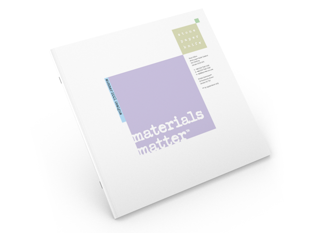
by admin | Jun 1, 2014 | |
Stone Paper Knife Ltd London-based, artist-lead ceramic design company Corporate identity and associated materials for an Artist-lead ceramics company. The look was based around the square theme and expressive layouts created for varied photography and press features. Work included catalogues styling, stationery, logotype, business cards. Designs featured in one episode of BBC’s Homefront. Tony Davis created the designs for a ceramic tile room installation based on dialogue with Lawrence Llewellyn-Bowen and the participants. All3D VisualsBookBrandingCatalogueCorporate IdentityDigital RetouchingFurnitureIllustrationLightingLogotypePackagingPrintProductStationeryTypefaceTypography Swallows and Amazons Digital Retouching, Illustration, Print, Product, Stationery Appleby: Notebooks Book, Illustration, Print, Product, Stationery TimeOut – iPhone 3D Visuals, Print, Product, Typography Designs Brochure Catalogue, Print, Stationery, Typography Faber Poetry Playing Cards Packaging, Print, Product, Typography Thesaurus Book, Print, Typeface, Typography Softbacks™ Furniture, Logotype, Typography Transport for London Branding, Logotype, Typography Treasure Island Book, Digital Retouching, Print, Typography U-Bend Lighting, Logotype, Product, Typography Milli Lighting, Logotype, Product, Typography Open Secret Branding, Logotype, Typography Stone Paper Knife Ltd Branding, Catalogue, Corporate Identity, Logotype, Print,...